muse · SMART TV & MOBILE APP
Operating system for a streaming smart TV and mobile app
team
DURATION
2.5 months
Year
2024
Overview
Muse is an operating system designed for a streaming smart TV, aimed at helping users navigate the overwhelming number of choices when selecting movies, series, or documentaries. It offers personalized recommendations from professionals in the film industry and integrates a social aspect for sharing with friends and family. Additionally, it includes smart home control features accessible via the mobile app.
Problem
Many users experience “choice paralysis” when faced with an abundance of content options, often feeling stuck when deciding what to watch. This leads to frustration and wasted time, which goes against the desire for a relaxing viewing experience after a long day.
Solution
Muse provides a unique AI-powered assistant specialized in the world of cinema.
Lists and suggestions from actors, directors, screenwriters, and other film professionals.
The ability to share and receive recommendations from friends and family.
Access to behind-the-scenes material, interviews, and related content to dive deeper into films or shows users have enjoyed.
Smart home
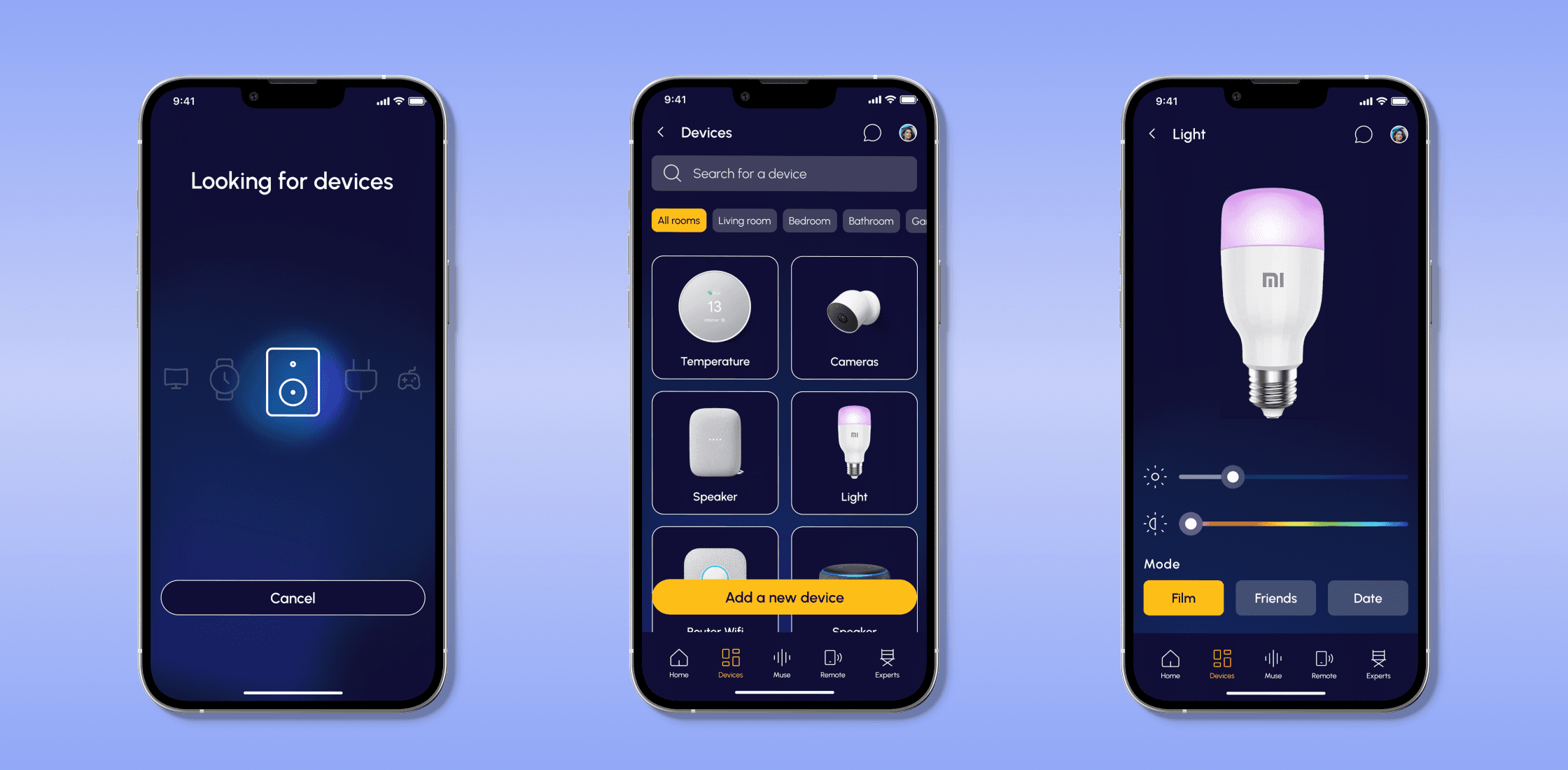
A mobile app that controls smart home devices, alongside accessing additional content and social features.
Design Process
01/
Research Phase
Competitor Analysis
User Personas
02/
Defining Phase
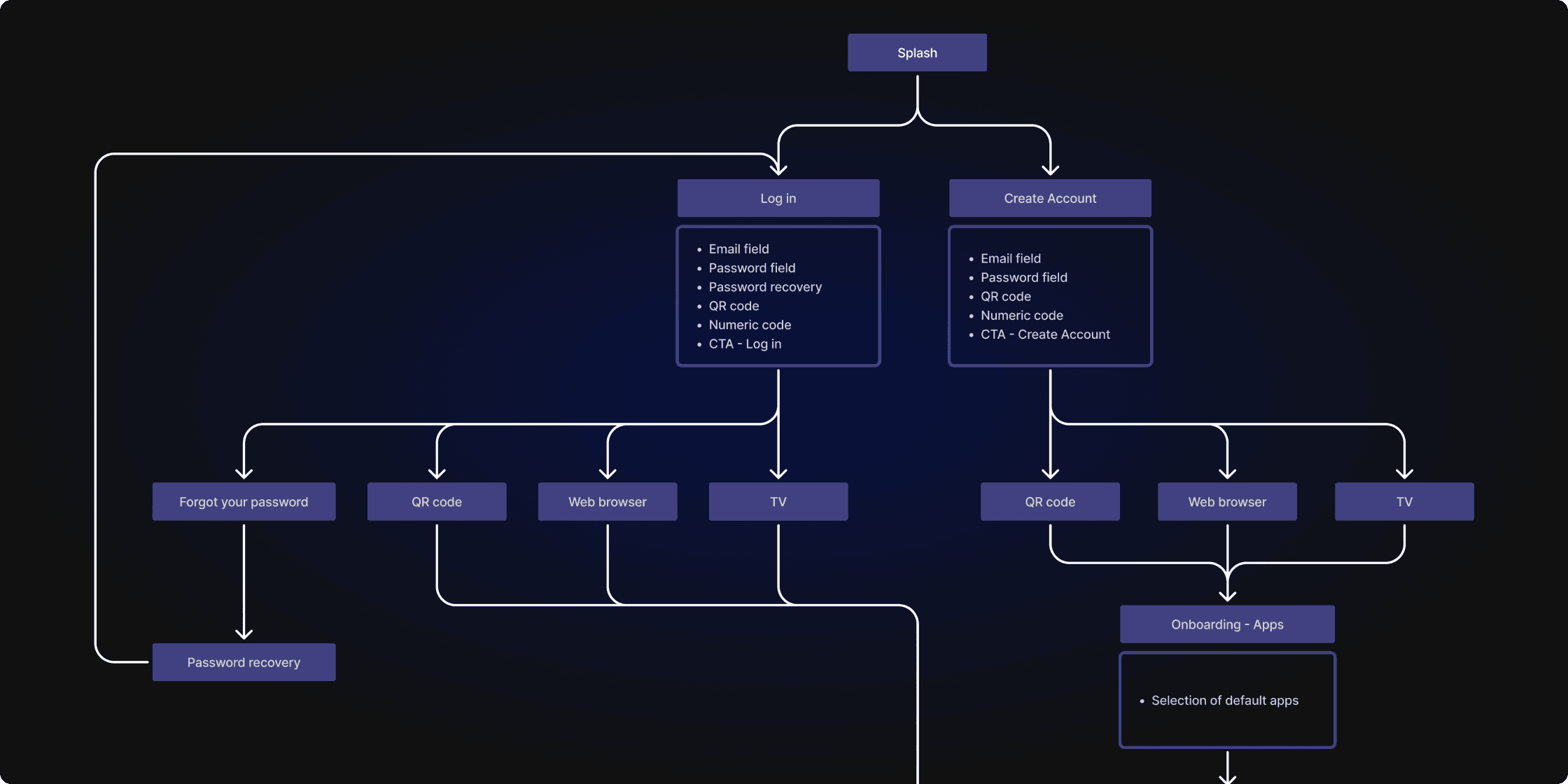
Information Architecture
Wireframes
03/
Design Phase
Visual Identity
Design System
Final Designs
Prototype
01/ research
Competitor Analysis & User Personas
Since we weren’t initially familiar with designing for TV screens and operating systems, we started by analyzing the competition and conducting informal interviews. Despite time constraints, these conversations helped us gather valuable insights to add meaningful value to the market. We spoke with users of these devices and, based on their feedback, created a persona to ensure we addressed their key needs and pain points throughout the design process.
02/ definition
Wireframes
For the wireframing phase, we focused on translating the information architecture into a visual layout, adapting the interface for each device. The wireframes allowed us to experiment with different layouts, ensuring that functionality and user flow were optimized before moving into the visual design phase.
03/ design
Visual Identity
We built the visual identity around the concept of the 21st-century muse—evoking inspiration, diversity, and connection. The visual identity was designed with the environment in mind, particularly the dark settings in which both the smart TV and mobile app would be used. This led us to adopt a dark theme as the foundation, complemented by a vibrant yellow accent color for greater contrast and visibility.
03/ DESIGN
Design System
We translated the visual identity into a comprehensive design system that extended across all elements of the platform. This ensured both visual and functional consistency while making the design adaptable to different screen sizes and user contexts. Accessibility remained a core principle, ensuring that all components were designed with inclusivity in mind.
03/ design
Final designs
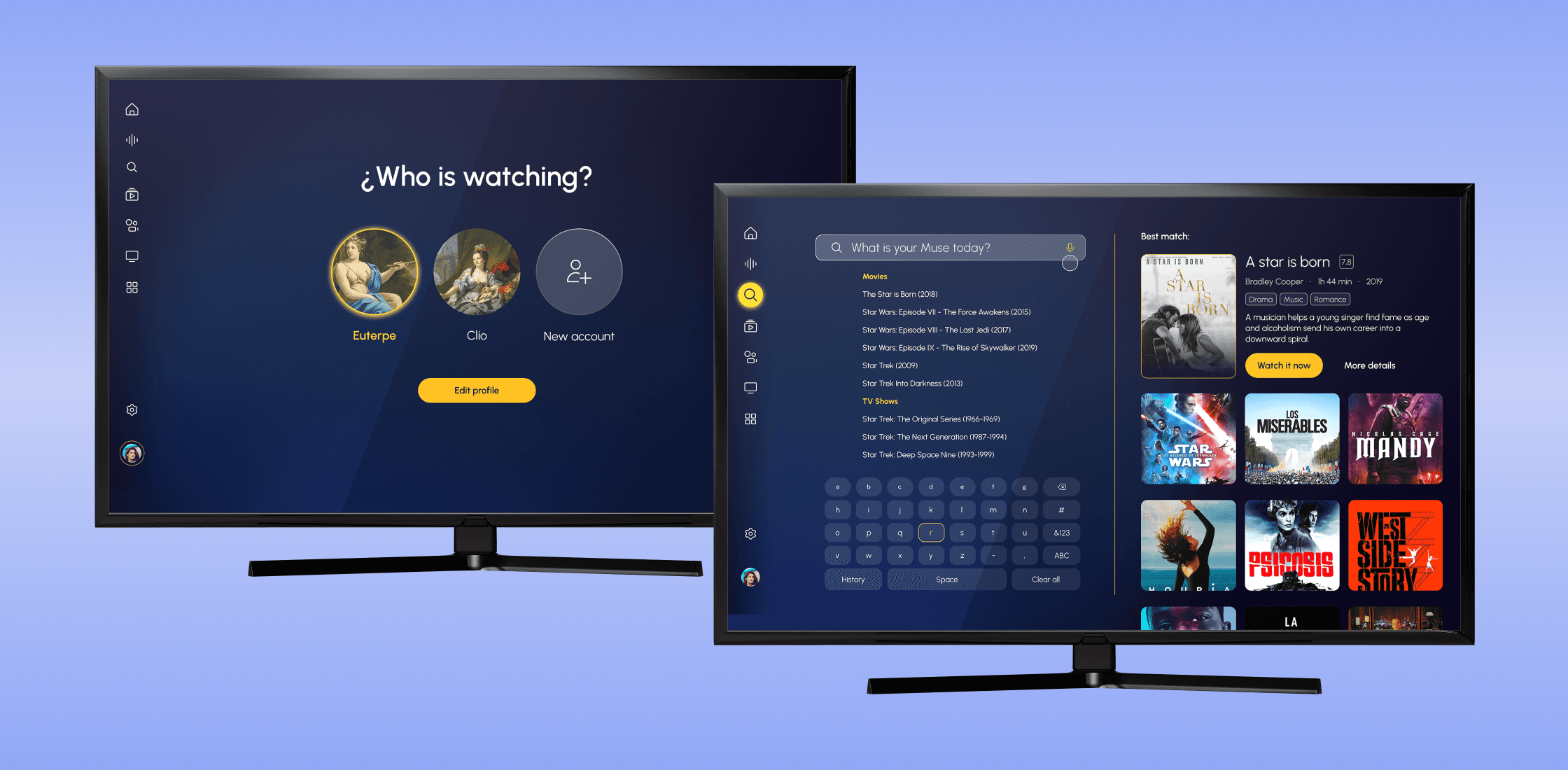
In the final design phase, we brought together all the elements we had developed throughout the project, refining the visual identity and user experience to ensure a polished, cohesive product. We focused on creating an intuitive interface that was consistent across both the smart TV and mobile app. Additionally, we developed interactive prototypes for both the smart TV and the mobile app, allowing us to test and demonstrate the flow and functionality in real-world scenarios.


